

Story Board: Home Tab
The Home tab provides end users with the key functions used most often for story board design.
Tab Buttons
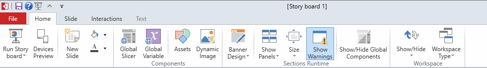
- Run Story Board - this button will launch the current dashboard in "runtime mode". This functionality is often used by designers to see how their story board will look when launched on a desktop browser.
- In the bottom half of the split button, you can also access the Runtime Options and Dashboard Timer from this button for creating auto-refreshing slides.
- Devices Preview - this button opens a dialog from which users can launch their story board in runtime to see how it looks for Phone, Table and PC formats. Click here for more.
- New Slide - adds a new slide to the dashboard.
- The color palettes offer a quick way to format the slides background color and key font colors.
Components
- GLOBAL SLICER opens a wizard for building and adding a new slicer for the ENTIRE story board (on all slides). Click here for more on Global Slicers.
-
GLOBAL VARIABLE opens a wizard for building and adding a new variable for the ENTIRE story board (on all slides). Click here for more on Variables.
- Assets - provides a mechanism to import new image assets into the application.
- Dynamic Image - opens a wizard for creating data driven infographic images. Click here for more.
Runtime
- Banner Design - this split button allows you to customize the runtime banner used at the top of your story board. The top of the button launches the banner design editor. The bottom lets you make a quick selection of style and its defaults. The quick selections include:
- Full Screen - provides a modern full screen dashboard with no visible tabs. Instead, users can click through the slide array using the arrows on the bottom left and right hand sides of the screen.
- Horizontal Tabs - provides a classic dashboard with tabs going across the top of the screen to choose between slides.
- Strip - provides a dashboard with a thin menu strip going across the top of the screen to choose between slides.
- Fisheye Menu - provides a more modern technique for picking between slides with a graphical "cover flow" type interface for picking between slides.
- Drop Down menu - provides a simplistic drop down box for users to choose between slides.
- Show Panels provides a toggle button to expose or hide the panel boxes that are applied to each pane on the canvas. Panel boxes are often used to keep the runtime interface clearer by demarcating the different query elements on the slide. See panels for more.
- Size - allows the user to configure a fixed pixel size for the story board. Without this configuration, the dashboard will auto size, both width and height, to fit the current window size.
- Show Warnings - provides a toggle button to expose/hide any warnings related to content issues for each panel. By default, this is set to on.
- Show/Hide Global Components - this function allows you to show or hide a Global Slicers or Variables for the current slide. When you Hide the component, the slide’s content will no longer be affected. You can click on Show to re-activate the Global Component. Click here for more information.
Workspace
- Show/Hide interactions is a toggle button that shows/hides the various interaction arrows drawn onto the slide's canvas. The split button also provides options to selectively show different types of interaction types. This button is also available on the Interactions tab.
- Workspace Type - allows users to choose from two predefined workspace layout options for Story Boards (content/layout).
Home |
Table of Contents |
Index |
User Community
Pyramid Analytics © 2011-2022